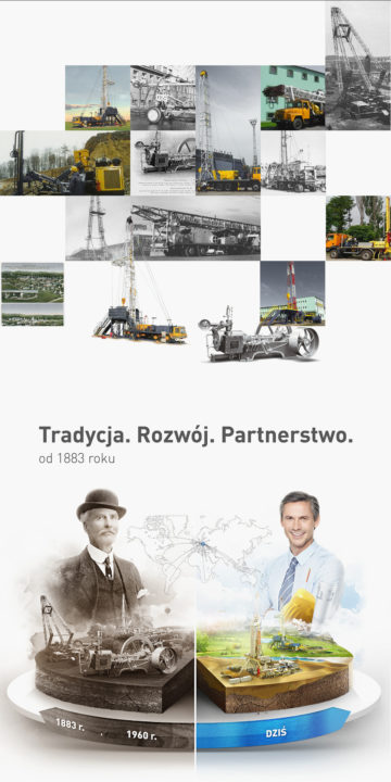
NiUW GLINIK Sp. z o.o. has manufactured tools and drilling equipment since 1883. Its recognized brand and highest-quality products make NiUW GLINIK one of the best producers of drilling tools in the world.
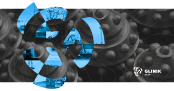
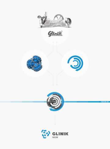
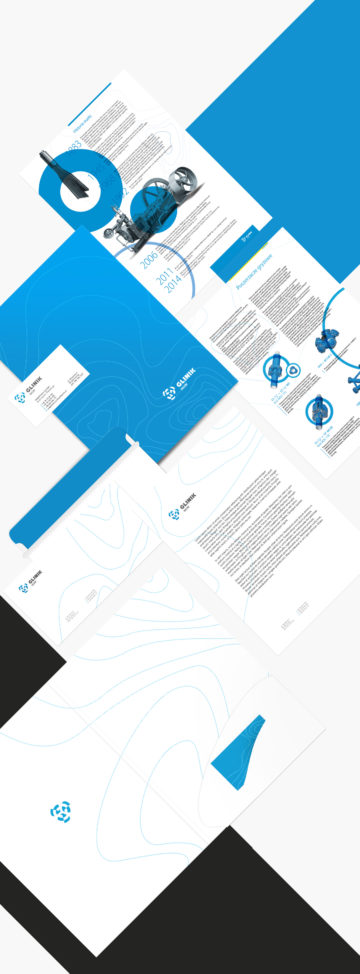
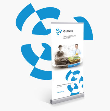
The task that we faced was particularly demanding due to the long, more than 100-years-long tradition of the company. Although the bar was raised high, we were able to develop a completely new, distinct corporate identity: in the symbol being part of GLINIK’s logo an image of the company’s flagship product—tricone bit—was included.
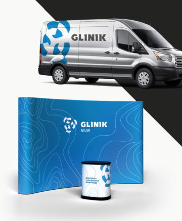
The process that GLINIK’s brand underwent was received positively by both the company’s partners as well as its dedicated employees. It helped us successfully conduct the whole rebranding process, which included the development of a key visual and a theme in the form of isolines—characteristic lines mapping the landform.
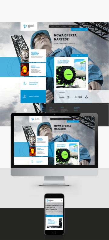
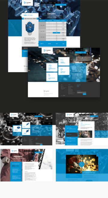
The themes developed in this way were then easily transferred into leading advertising media (including exhibition elements) and onto a functional website with an advanced drilling tool configurator.
Moreover, the implementation of the website based on our original CMS allowed us to create easy-to-use contact forms generating valuable sales leads for GLINIK’s Sales and Marketing Departments.